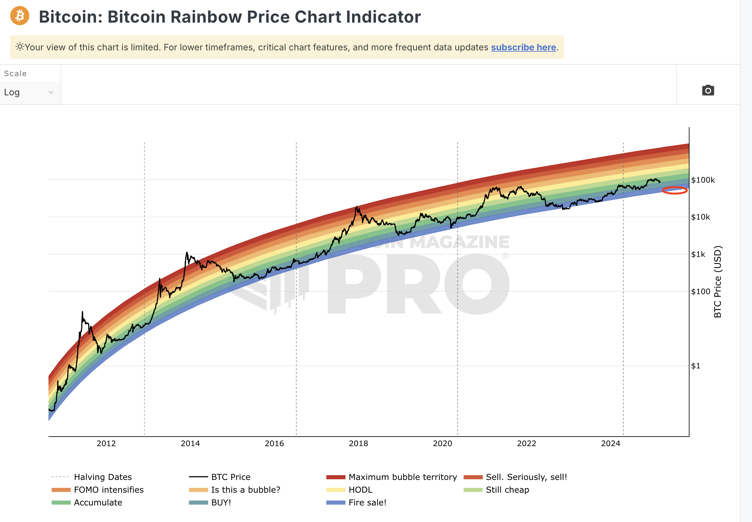
The #Bitcoin Rainbow Price Chart uses a logarithmic growth curve to visualize  $BTC long-term valuation and market sentiment. It highlights periods of overvaluation (warmer colors) and undervaluation (cooler colors), suggesting buying during cooler phases and profit-taking during warmer ones. While updated daily with historical price data, the chart is not an investment tool but a fun indicator for observing market cycles. It provides insights into potential future trends, but should not be relied upon for direct investment decisions.

7
188
4
3
 Most Visited
 Community Sentiment
 Chain Ranking
 Bitcoin Dominance
 Overall NFT Stats
 Upcoming Sales
 New Pairs
 Trending Pairs
 Meme Explorer
 Gainers & Losers
 Community Votes
 Top Traders
 Feeds
Feeds Topics
 Lives
Lives Articles
 Research